


three effective rules for good posters
 Posters. The drift to digital is strong but they still have a place in the comms armoury. They can be as powerful or as weak as you design them. But what do good ones look like?
by Susan Neal
Many hours have been wasted by me and my former Council communications colleagues in trying to convince services about the best way of getting their message across.
Yes, wasted because the message often fell on stony ground. Nowhere more so than in discussions about posters. In this digital age we often forget that some traditional forms of advertising still have a place. This is particularly true in Dumfries and Galloway where mobile coverage is still iffy and where may people still have to be persuaded that having a computer is ‘A Good Thing’*. It doesn’t mean that social media channels aren’t effective, just not for some.
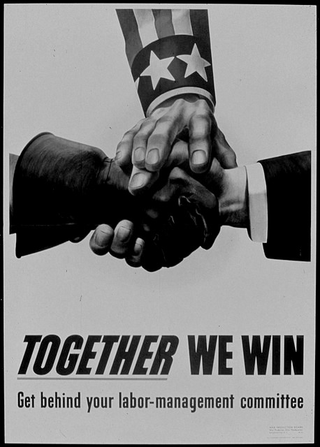
Posters in libraries, public buildings, doctors’ surgeries and workplaces still bring good results, but only if they are good posters. What makes a good poster? Well it certainly isn’t filling it with a huge amount of information in Arial 12pt.
On a recent rip to Albi, France, a visit to the Toulouse Lautrec Museum highlighted the best in poster art from the artists who were its originators, including Jules Cheret, Pierre Bonnard and TL himself. What do their posters have in common?
- Bold headlines
- Arresting artwork filling the background, often in a limited colour palette
- A very limited amount of text - large for the headline to grab the attention and smaller text tucked away at the bottom of the poster for anyone wanting to find out more.
That’s it. Simple rules and I make no apology for stating something you probably know already. The poster is to grab someone’s attention from a distance and give them the urge to find out more and contact details where they can do that. Even some of the viral posts on social media are photo or art backgrounds with a pithy message. Using a limited colour palette can be arresting and can become a recognised part of your service’s or company’s style.
Most councils have good graphic designers these days - use their expertise. Ban all those amateur efforts using Publisher that give communications officers the pip.
Anything with more text is not a poster - it’s a flyer. That’s another story.
More about the poster art of Toulouse Lautrec http://bit.ly/1vnYNzb
Susan Neal is owner of Sherwood Communications and Marketing.
 Print Article
Reader Comments