


budget infographics: making the figures make sense
There is nothing like an infographic to make a big pile of numbers make sense. For the public sector explaining what they do has never been more important. In this brilliant case study one authority has used the web to create something interactive.
by Sarah Lay
I admit it; I’ve never really been one for figures. At best they confuse me, at worst they scare me. So being tasked with leading a project to translate Nottinghamshire County Council’s budget book into a format people could more easily get to grips with – people like me who cringe inwardly at the thought of wading through an accounts spreadsheet – was just the sort of challenge I liked.
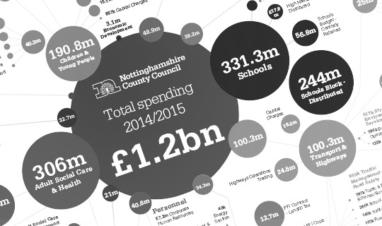
And today we’ve released what we’ve created; an interactive infographic taking all the Council’s budget expenditure for 2014/2015 and displaying it in a more interesting, and hopefully easier-to—understand, format.
Try it for yourself on our website at www.nottinghamshire.gov.uk/whatwespend.
The infographic has been created in-house making use of free Bubbletree code, which was created by the Open Knowledge Foundation, and we’ve also followed great infographic examples on budget spend by central government from the Guardian. At a time when the Council is facing cuts of £154mwe think this helps people understand where our continuing £1.2bn spend is going across our services.
This is the first infographic online but is backed by a range of colour-coded graphics which will appear in the Council’s new County Life publication for residents. These are designed to help make council tax, as well as budget information, easier to understand.
The interactive infographic also sets the direction we’ll be taking with digital development in the future – that complexity is best delivered with simplicity and taking an approach will be agile, open and iterative.
We’ll be adding more infographics to this range – we’re already planning versions for Council income and to cover our Net Budget. These will bring with them their own challenges but ultimately will help us communicate the often complex, but vital, topic of finances with the people of Nottinghamshire.
Sarah Lay is a senior digital officer at Nottinghamshire County Council, and communications and community management lead for localGov digital.
Missing us? Want to stay up-to-date? Make us smile. You can sign up for our regular email newsletter right here.
 Print Article
Reader Comments (2)
I absolutely blooming love this. It's really difficult to let people know what their money is being spent on. There are some really big figures to bandy about and for me an infographic is a no brainer to help explain it. It would be good to know what kind of response this got from residents too.
Sarah, this is a fantastic interactive tool. I love the ability to drill down into each service area. I was set the same challenge for Bucks County Council. As well as doing a budget spend infographic, I and a colleague developed an animated video using GoAnimate, to explain in visual terms more about our spending and the wide range of our services. You can check it out at www.buckscc.gov.uk/tax.